- Cisco Community
- Technology and Support
- Networking
- Networking Knowledge Base
- Best Practices for Creating Effective Executive Dashboards
- Subscribe to RSS Feed
- Mark as New
- Mark as Read
- Bookmark
- Subscribe
- Printer Friendly Page
- Report Inappropriate Content
- Subscribe to RSS Feed
- Mark as New
- Mark as Read
- Bookmark
- Subscribe
- Printer Friendly Page
- Report Inappropriate Content
04-01-2024 11:11 AM - edited 04-19-2024 07:24 AM
General Overview
In today's fast-evolving business environment, executives heavily depend on data-driven insights to make prompt and well-informed decisions. Executive reporting plays a pivotal role, offering immediate access to crucial key performance indicators (KPIs) and actionable insights vital for steering business strategies.
This post delineates key best practices, strategies, and hands-on advice for crafting a compelling executive dashboard utilizing ThousandEyes. While primarily focused on a Software as a Service (SaaS) context, the principles presented are flexible and applicable across diverse scenarios.
Best Practices Summary
- Define clear objectives. When building executive dashboards, clarity is key. Clearly define the objectives and use case of your dashboard—whether it is, for example, monitoring network performance health, tracking applications or user experience, etc.
- Know your audience. It is relevant to understand the key performance indicators (KPIs) that matter most to your audience, and to determine the level of detail they require and which personas will access the dashboard. For example, IT Management and NOC Teams may require different viewpoints.
- Select relevant metrics. The choice of metrics and time intervals is critical in creating impactful executive dashboards. Metrics like application performance, network latency, and packet loss are some examples. In addition, ensure that the data intervals align with the desired presentation period, such as 24, 48 hours, etc.
- Embrace visualization. Correct visualizations are key for communicating complex information clearly. When constructing executive dashboards, leverage visual widgets to present data in an intuitive and actionable format. The ThousandEyes platform provides a diverse array of options, enabling customization to suit the preferences of your executive audience.
- Schedule regular report snapshots. Arrange automated snapshots of the report at scheduled intervals to ensure consistent tracking and documentation of performance metrics over time.
Executive Dashboard & Widgets Overview
Below is a demonstration of an executive dashboard, providing a comprehensive overview of the performance metrics of essential SaaS (Software as a Service) applications across multiple regions.
In addition, this section provides an in-depth exploration of each widget displayed on the executive dashboard, offering comprehensive insights into their functionalities and significance.
You can find a live dashboard example here, and details of each widget and what they do below:
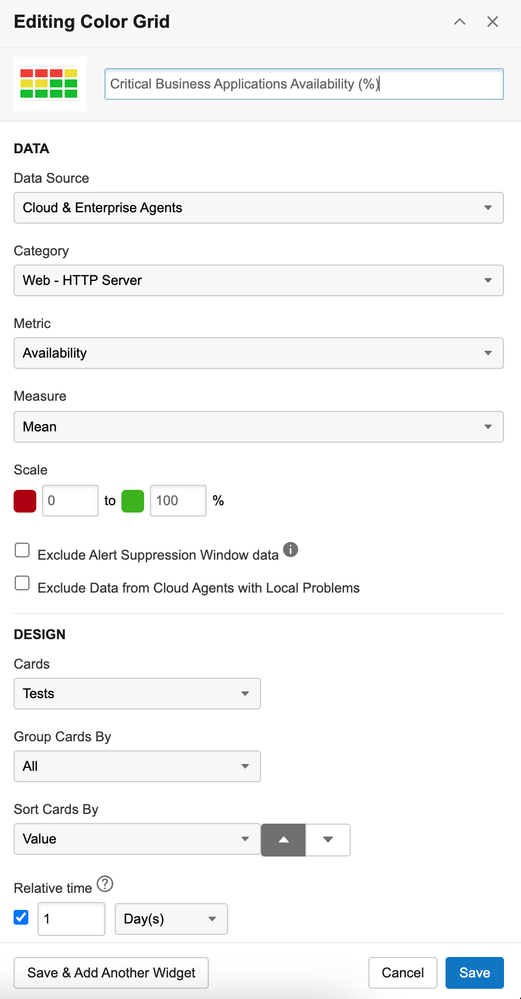
Top Business Application Availability (%):
This widget offers a comprehensive view of the current global average HTTP availability across key applications critical for business operations.
Using a color grid widget, data is visually depicted, organizing cards from lowest to highest availability. This layout accentuates applications with lower HTTP availability, enabling focused attention on areas that may need improvement or immediate action to ensure peak performance and reliability.
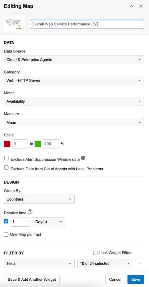
Overall Web Service Performance (%):
The global map serves as a valuable resource for gaining insights into the distribution and comparative analysis of web service performance worldwide. It plays a significant role in facilitating strategic decision-making and optimization efforts aimed at improving digital service delivery across various regions and platforms.
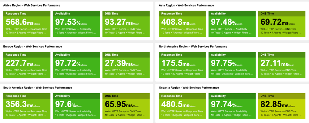
<...> Region - Web Services Performance:
The implementation of the data number card facilitates the representation of specific metrics tailored to individual regions. Through the allocation of HTTP metrics per region, a more nuanced comprehension of web performance is attained, thereby enabling in-depth analysis and strategic optimization efforts.
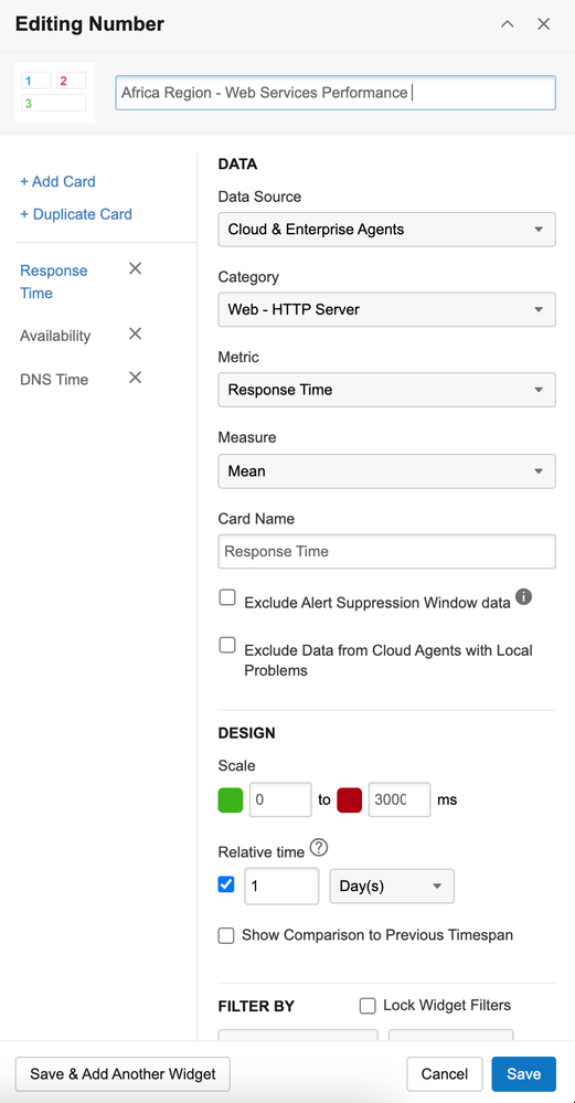
Note: When setting thresholds for metrics such as Response Time, where milliseconds (ms) are specified, it is recommended to consider, for the maximum value of scale interval, at least three times the average measure. This suggestion applies particularly in the absence of specific definitions for SLAs/KPIs.
For instance, if the average Response Time over the last 24 hours is 1000ms, a prudent approach would be to set the maximum threshold interval for the card at 3000ms.
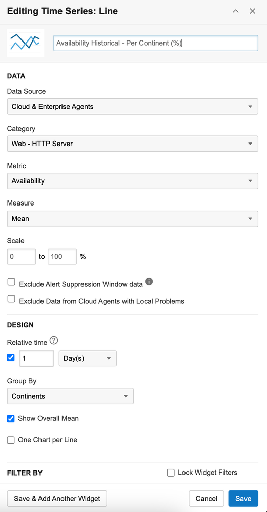
<...> Historical - Per Continent (%):
The line time series widget offers the flexibility to overlay multiple metrics or exhibit separate charts, whether vertically stacked or arranged side by side.
This graphical depiction of time-series data provides a comprehensive understanding of historical trends, giving you valuable insights into performance patterns and fluctuations over time from a specific point of reference (e.g. from each region/location).

Extra Tips for Dashboards/Widgets
- Maintain concise widget names. Opt for brief widget names to ensure clarity and ease of navigation.
- Use embedded widgets for external visibility. You might want to integrate a Dashboards widget(s) into an external webpage. Embedding a widget can deliver the same data available through a ThousandEyes login, directly on the external webpage.
- Incorporate metric types in widget titles. Including the type of metric within the widget name (e.g., percentage, milliseconds) will enhance comprehension.
- Prioritize key SLAs/KPIs/metrics. Position essential Service Level Agreements (SLAs), Key Performance Indicators (KPIs), and metrics prominently at the top of the report.
- Limit the number of displayed cards. Restrict the quantity of cards highlighted on the dashboard to prevent clutter and maintain focus on critical information.
- Utilize dashboard filters. This feature applies a unified set of filters to an entire dashboard, eliminating the need to adjust widget settings individually. Filters save time and offers an efficient method for monitoring diverse data views without the need for constant adjustments. In the example shown, we applied the following filters to display only the "SaaS Apps" test label:

Please note that Dashboard Filters are only configurable directly within the account dashboard settings.
By following the above best practices and leveraging the robust features of ThousandEyes, organizations can create executive dashboards that provide decision-makers with actionable insights, drive strategic initiatives, and enhance business success.
ThousandEyes Documentation Reference
- Mark as Read
- Mark as New
- Bookmark
- Permalink
- Report Inappropriate Content
Nice..information..!! and Thanks for sharing..!!
Find answers to your questions by entering keywords or phrases in the Search bar above. New here? Use these resources to familiarize yourself with the community:


